

moody | 品牌規劃及包裝設計
branding & Packaging
_
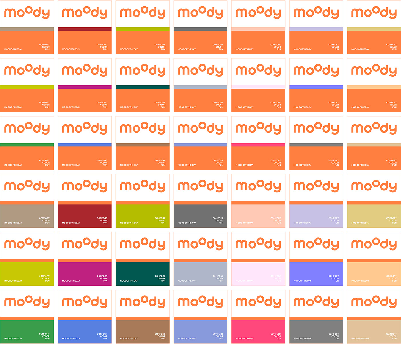
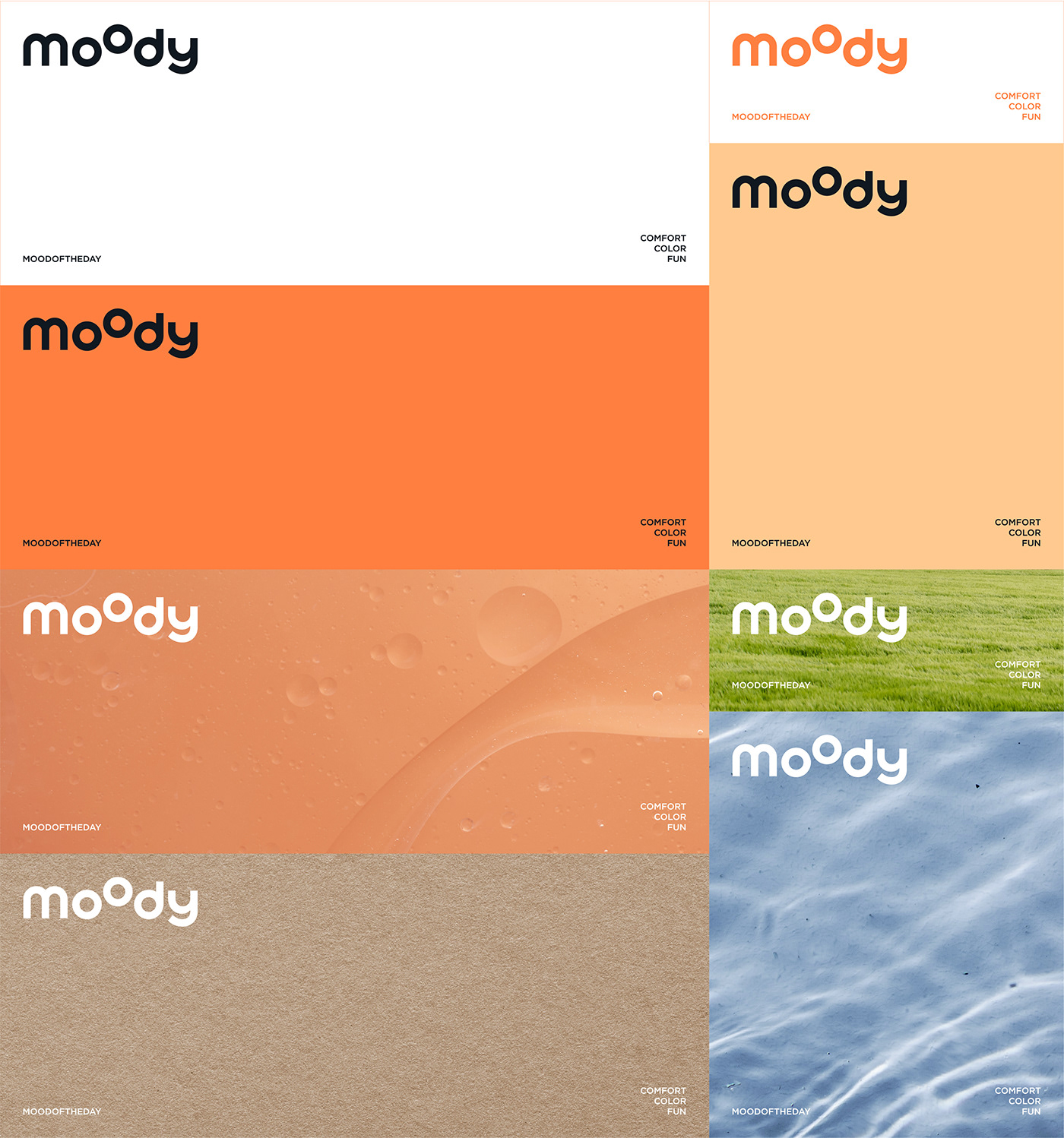
這是moody誕生的第四年,從勵志做行業標竿引領品類提升舒適度準則以外,更多希望在深度用戶當中積累故事產生共鳴,moody不再只是一個品牌名稱,而是一種概念,他與日常緊密結合。期盼在初代moody的 專業、中性、大眾 等品類基礎關鍵字上,強化 舒適、色彩、有趣 的個性化標籤。兩顆圓點,是moody的oo,也是臉上的雙眼。“不是所有的品牌升級都需要改變”以加法原則進行品牌改造,logo不變但設法豐富內核。
如果將moody擬人化,那他會是日常的你和我,在平凡之中想要有點不同,那個不同可以是一位銀行員在下班後選擇學習畫畫,也可以是在妝容當中選擇美 瞳點綴臉部細節,是一種生活上的小改變。也是「日常不平常,平凡不平淡」的品牌的核心精神由來。這樣的概念如果要賦予視覺,首要條件必須帶有品牌色彩和形狀,且時常出現在生活場景。於是品牌拍攝以及產品當中總是默默帶入橘子,它像徵日常,也是一種活力能量的展現。
橘子隨處可見,四季皆有,消費者看到這個物件就能想到moody。是一種平易近人的存在,同時也是moody想給予消費者的舒適感,一些生活中有趣卻溫和的小事件。
This marks the fourth year since Moody's inception. Beyond being an industry benchmark and leading in elevating category comfort standards, there is a deeper aspiration to accumulate stories that resonate with devoted users. Moody is no longer just a brand name; it has become a concept intimately intertwined with everyday life. The goal is to reinforce the three personalized labels—comfort, color, and fun—on the foundation of professional, neutral, and mainstream keywords related to the initial Moody brand.
The two dots represent Moody's "oo," which are also the eyes on a face. Following the principle of addition, brand transformation is aimed at enriching the core without altering the logo. If Moody were personified, it would be you and me in everyday life, seeking a touch of distinctiveness in the ordinary. It could be a banker choosing to learn painting after work or adding colored contact lenses to enhance facial details in their makeup—a small change in everyday life. This embodies the core spirit of the brand: "Everyday, Uncommon; Ordinary, Not Dull." To visualize this concept, the primary condition is that it must carry the brand's colors and shapes and frequently appear in daily settings. As a result, the brand's photography and products consistently incorporate the "orange," symbolizing the everyday and showcasing a vibrant energy.
“Orange” is ubiquitous, present in all seasons, and when consumers see this object, they instantly think of Moody. It is a familiar presence, providing consumers with a sense of comfort, as well as representing the mild yet interesting moments in life that Moody wants to offer.
╯
Art direction ╱ Ivory Ho
VIS ╱ Ivory Ho
Logo Design ╱ A Black Cover Design
Packaging Design ╱ Ivory Ho
Location ╱ Shanghai


